Cannoe
Challenge
The novelty of legalization created a wave of cannabis brands that did everything other than the one thing people actually wanted: make it normal. The team at Cannoe wanted to create a brand that integrated into communities and could become a part of everyday life, just like your favourite coffee shop.
The novelty of legalization created a wave of cannabis brands that did everything other than the one thing people actually wanted: make it normal. The team at Cannoe wanted to create a brand that integrated into communities and could become a part of everyday life, just like your favourite coffee shop.
Solution
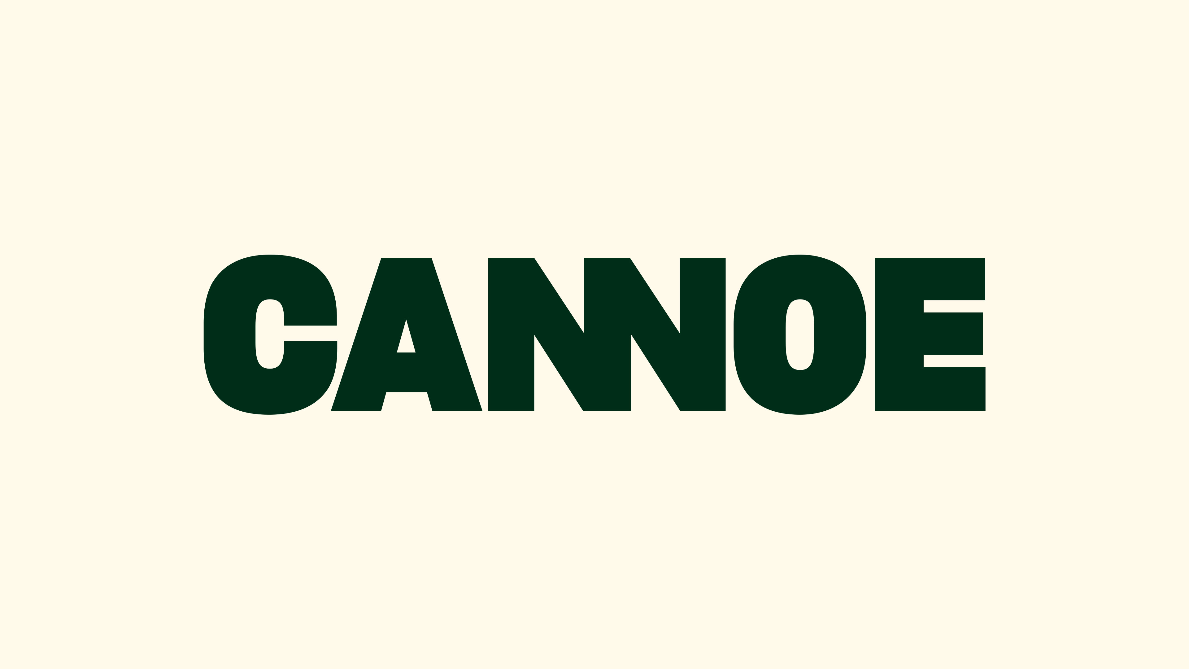
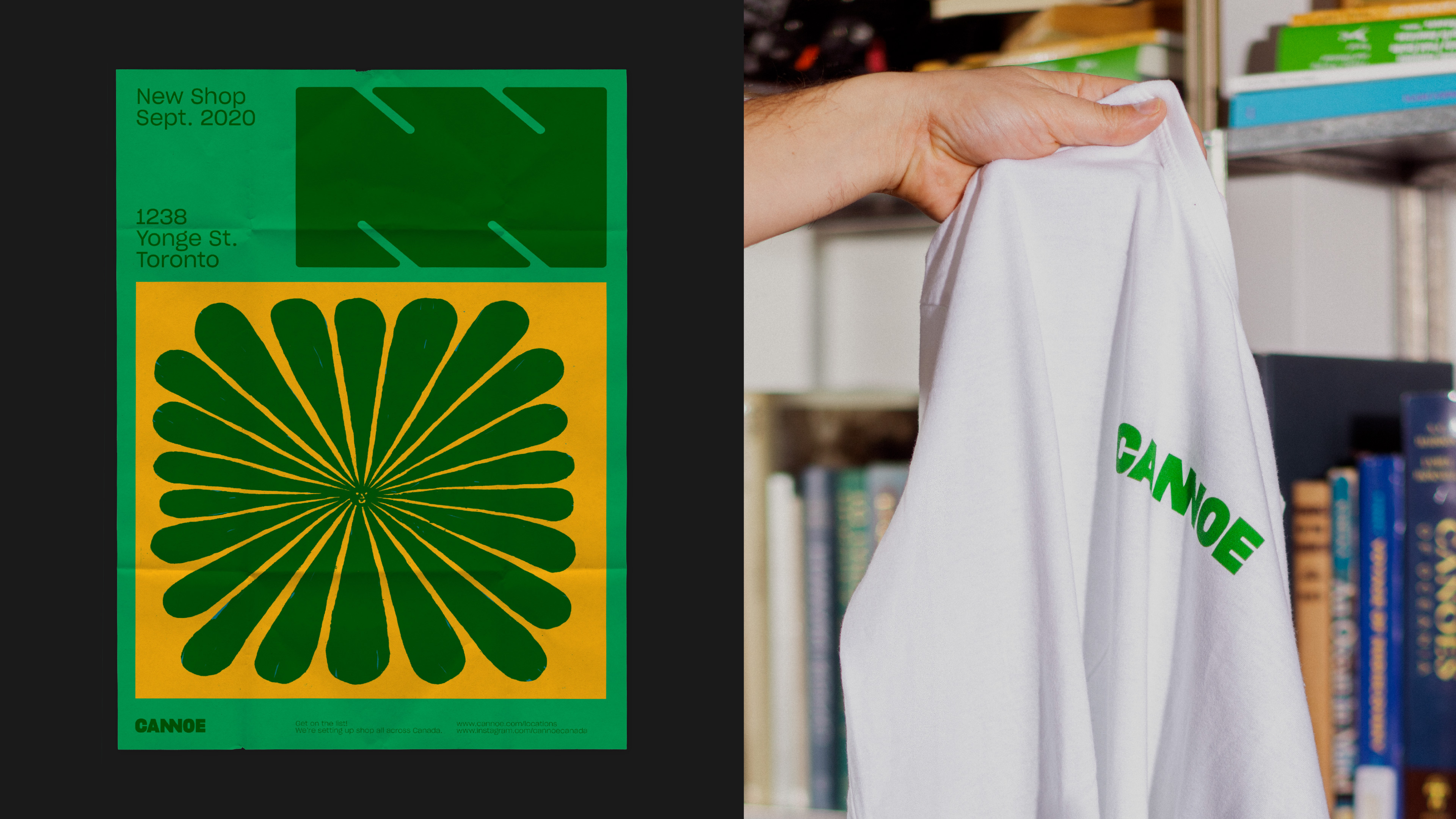
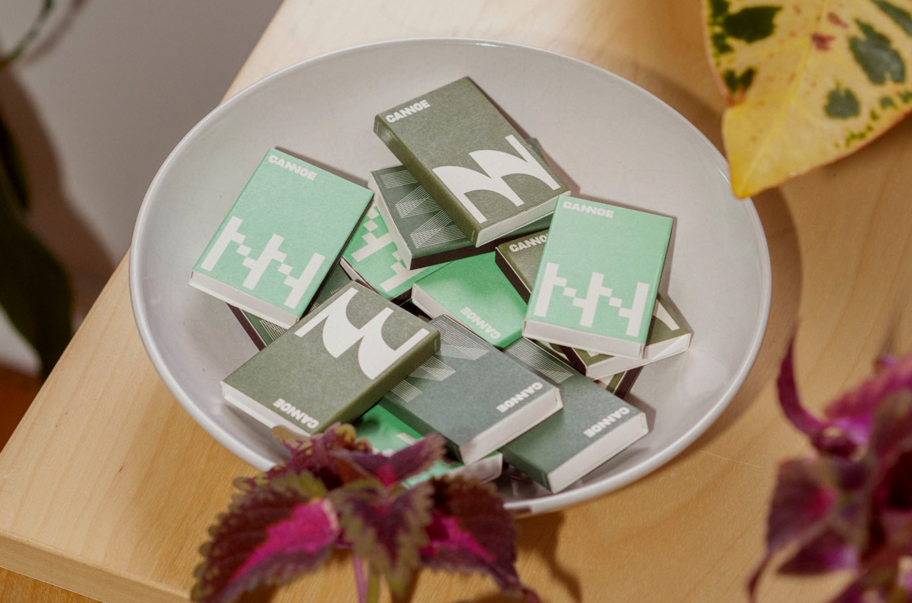
Taking inspiration from the diverse neighbourhoods and reasons people consume cannabis, we developed a brand with the flexibility to meet any location or occasion. The colour palette — any green, but only green – gives the identity the ability to fade in or stand out without getting lost. The NN ligature in the core wordmark increases readability, while the ever-changing NN icon can respond to the neighbourhood, architecture or canvas.
Taking inspiration from the diverse neighbourhoods and reasons people consume cannabis, we developed a brand with the flexibility to meet any location or occasion. The colour palette — any green, but only green – gives the identity the ability to fade in or stand out without getting lost. The NN ligature in the core wordmark increases readability, while the ever-changing NN icon can respond to the neighbourhood, architecture or canvas.


