Murf
Challenge
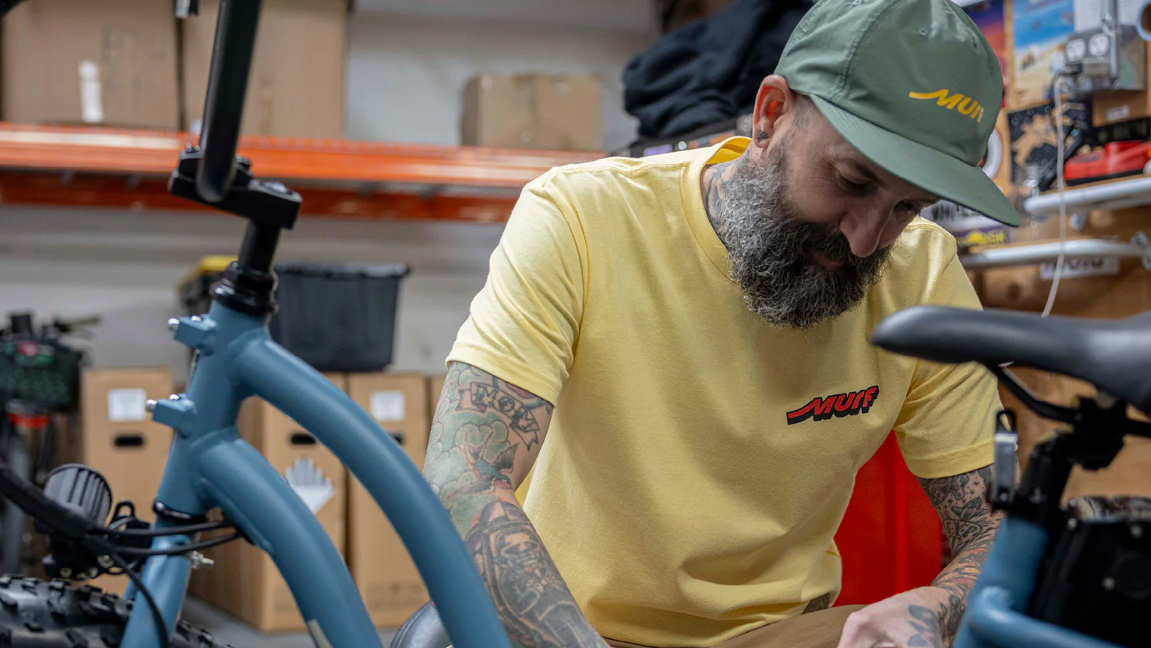
Our friends at Murf had two great starting points for their brand: An e-bike people loved and a weird name. As they were looking to expand from being a local San Clemente favorite to a national player, they needed a visual identity that was true to their roots and unique in an increasingly crowded market.
Our friends at Murf had two great starting points for their brand: An e-bike people loved and a weird name. As they were looking to expand from being a local San Clemente favorite to a national player, they needed a visual identity that was true to their roots and unique in an increasingly crowded market.
Solution
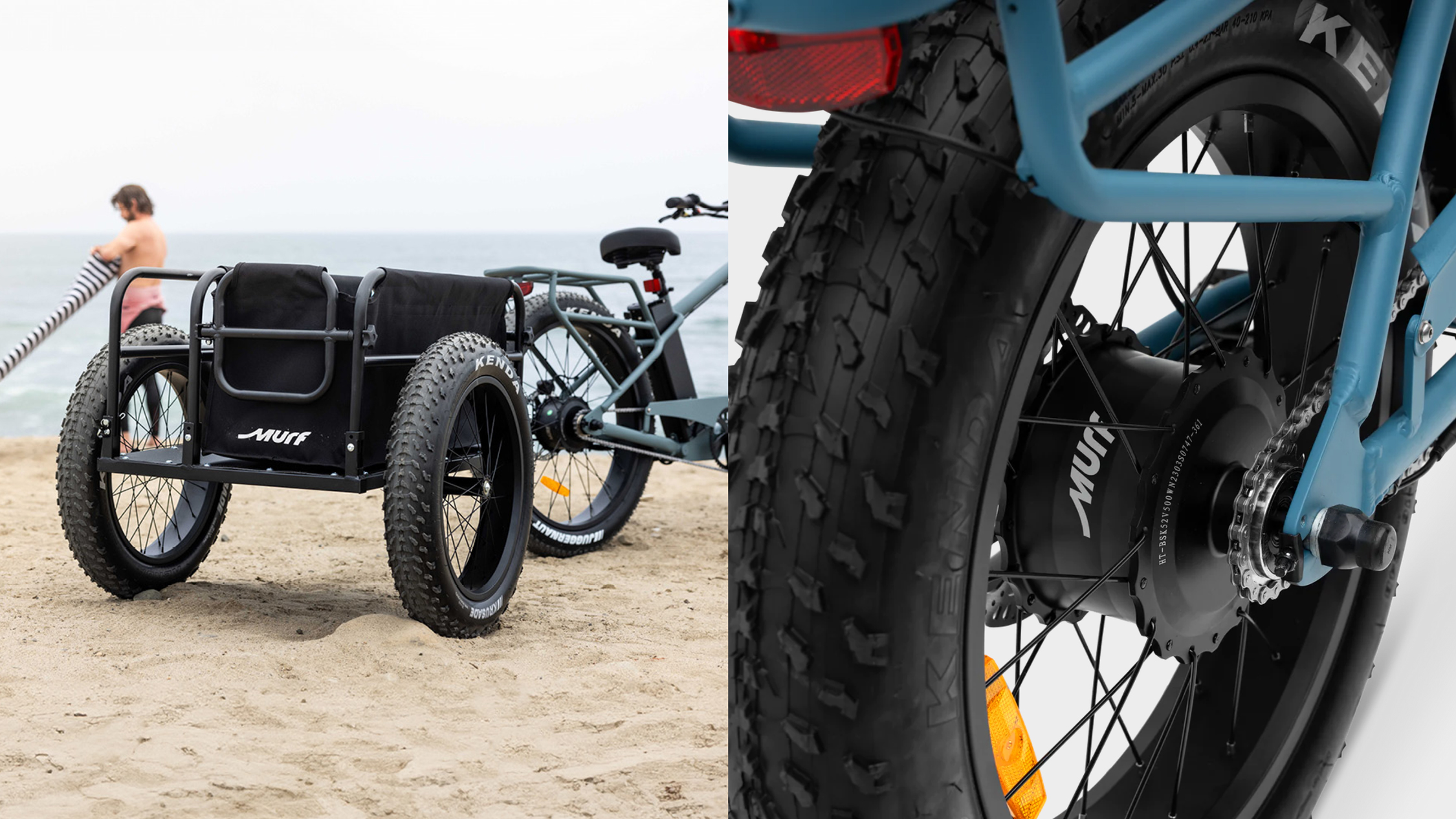
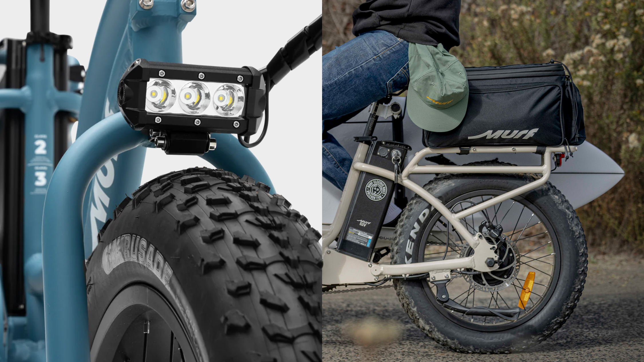
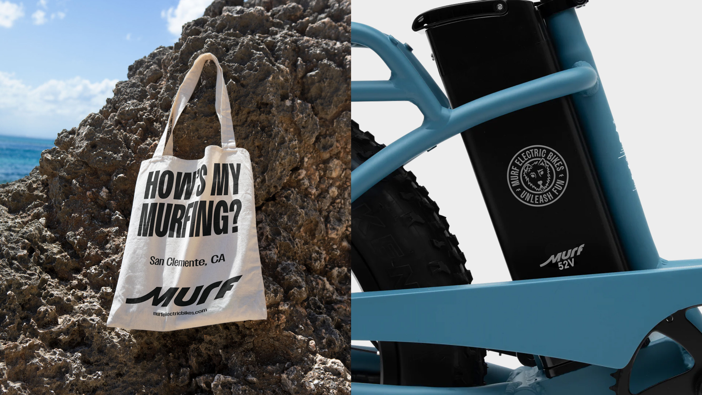
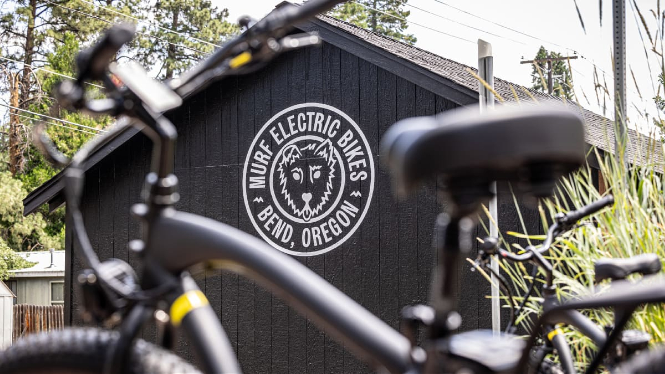
We worked with the Murf team to focus the brand around the feeling they provided, not just the product they produced. That impossible-not-to-smile acceleration on the way to the beach is what the new identity is all about. A new wordmark captures the speed of the e-bike and surf style Southern California is famous for. The color palette takes inspiration from the flora that lines the beaches of San Clemente. Murf, the founders’ dog’s name, is admittedly a weird word — we worked to maintain the unique starting point and extend the design to incorporate an illustration of Murf in the secondary mark, and a reference to the brand’s muse in the tagline: Unleash Fun.
We worked with the Murf team to focus the brand around the feeling they provided, not just the product they produced. That impossible-not-to-smile acceleration on the way to the beach is what the new identity is all about. A new wordmark captures the speed of the e-bike and surf style Southern California is famous for. The color palette takes inspiration from the flora that lines the beaches of San Clemente. Murf, the founders’ dog’s name, is admittedly a weird word — we worked to maintain the unique starting point and extend the design to incorporate an illustration of Murf in the secondary mark, and a reference to the brand’s muse in the tagline: Unleash Fun.