Spruce
Challenge
For over six decades, H&R Block has built a reputation around taking a more human-centric, simplified, and accessible approach to the complicated and important process of filing taxes, supporting millions of people across North America. Working with more than 21 million clients annually, they heard stories of working families who were living paycheck to paycheck, struggling with their finances. The people most in need of help seemed to have it the worst.
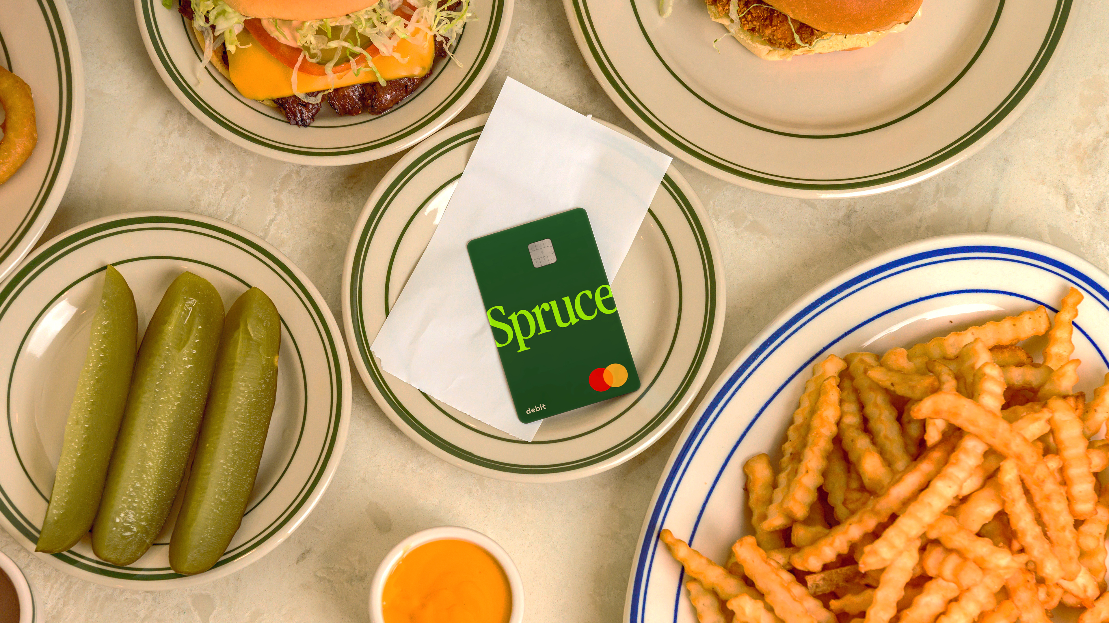
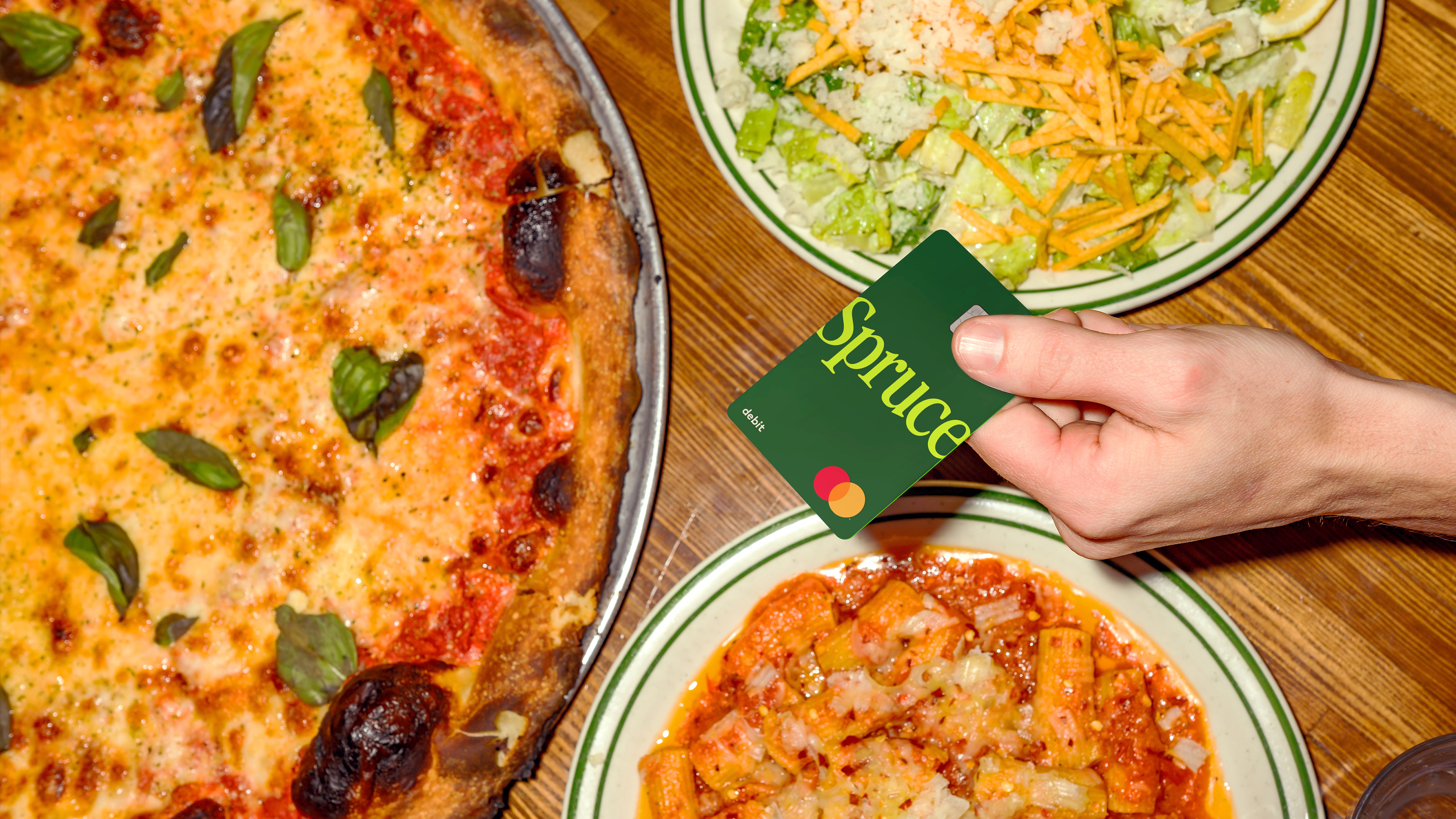
Though helping file taxes is a vital service, it only happens once a year and H&R Block saw an opportunity to expand their services and help their customers be better with their money year-round. Enter: Spruce— a mobile banking app and debit card, and the latest addition to H&R Block’s growing ecosystem of services, products, and brands that aim to better serve people and small businesses. The brand identity for this new platform needed to fit within the H&R Block ecosystem, but also establish itself as a distinct offering.
Spruce is designed to help people not only get their finances on track, but to also get ahead in their financial planning—whether that means saving for something special or understanding their credit score. Empathetic features give people the ability to make the most of their money and be better protected from the inevitable bumps in the road—and their brand identity needed to reflect this.
Solution
The new brand is designed to build off the trust and awareness of H&R Block’s existing brand, while not relying on it exclusively. From name to color, to typography, the brand creates a connective tissue across the ecosystem, while allowing Spruce to connect with new and existing customers.
The new brand is designed to build off the trust and awareness of H&R Block’s existing brand, while not relying on it exclusively. From name to color, to typography, the brand creates a connective tissue across the ecosystem, while allowing Spruce to connect with new and existing customers.


